Building in Public: Day 34 - Reviving an Abandoned Project Into a Game, in One Weekend
It’s Been a While
My last post was Day 33. Almost five months went by after that with nothing published. I’d written that I was going to “regain momentum,” but that didn’t last either. Traffic wasn’t moving, so it got harder to sit down and open the project, and eventually it just went quiet in a drawer.
Then this weekend gave me a reason to open the laptop again.
Everyone Was Burning Through Fable This Weekend
Anthropic reopened Fable 5 and let it run without extra usage charges for the weekend. I’d guess a good chunk of Claude users out there were racing to build something before the window closed. I was one of them, except instead of starting something new, I decided to go back and fix something old.
The plan was simple enough: take a site that had been sitting untouched for months and rebuild its whole feel, in a day, into something closer to Reigns.
The Goal: Stop Being a Website, Start Being a Game
What If Classics turns classic novels into 3-5 minute choice-driven stories that end with an MBTI-style result card. The first thing I built with Fable this weekend was exactly this piece: replacing the old click-a-button choice interface with a drag-the-card-left-or-right swipe instead. All six stories got restructured into pure binary choices, dragging the card gave it real tilt physics, and the ending got a 3D flip reveal for the personality card, all shipped the same day.
The problem showed up right after. The swipe was the only game-like thing about it. Everything around it was still a static site running on what was basically a plain blog template.
To change the site’s overall Look & Feel, Fable and I looked at Reigns’ game design as a reference: a full-screen dark stage, one card at a time, a faint stack of cards behind it, resource meters up top. The conclusion was that maybe 80% of what makes Reigns feel like a game is that frame, not the swipe itself. Though there’s one decisive difference worth admitting here: Reigns is an actual Unity-based mobile game, while this site runs on the Astro framework.
So we split the work into two passes. First, turn the story-reading screen itself into a proper game shell. Then, once that worked, redo the rest of the site, the homepage, the library, even the blog, as the game’s own menu screens. My original instinct was to draw a clean line: “story-play is story-play, the site is the site.” But once the first pass shipped and I actually clicked through it, the seam was jarring. Hit Play and you dropped into a dark game; hit exit and you got thrown back onto a bright blog page. So I reversed that call. The whole site became one dark stage, and the cream-colored card became the only “light” surface anywhere, like something you’re holding in your hand rather than a page you’re reading.
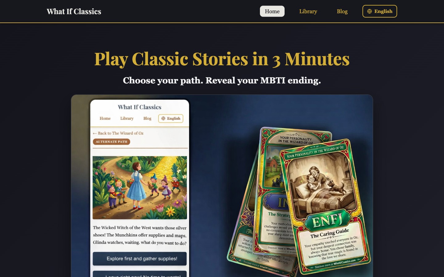
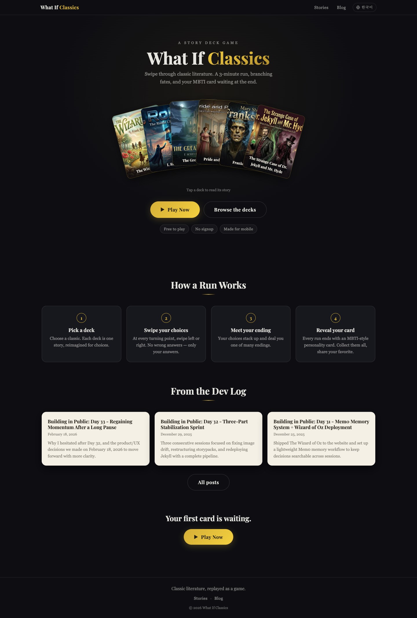
The old homepage (top) had only gotten a dark coat of paint at that point, structurally it was still a nav bar, a headline, and a phone mockup screenshot, the same landing page shape as before. Now it’s a title screen with all six real story covers fanned out and overlapping like a hand of cards.
We shipped one commit per major milestone, and I’d told it upfront it didn’t need to check in with me after every single one. I still stayed in the loop at the bigger forks, like the one above.
What Broke When I Actually Played It
Building it to spec wasn’t the same as it actually working. The real problems only showed up once someone played through it for real.
Checking the ending screen turned up something pretty serious: on a phone, the page ran much longer than it did on a PC screen, and there was no scroll container inside it at all. The share button, the download button, all of it was physically unreachable.
After one round shipped, I played it on my actual phone and gave Fable feedback. One note was that the card text was long enough that I had to tap through a pagination step to see the rest of it. Fable opened all 640 story nodes across the six packs, counted characters, found that close to half of them ran too long for the card, and trimmed them on the spot. On desktop there was also a bug where dragging a card and releasing the mouse outside the browser window would leave it stuck mid-swipe, the kind of thing you only ever find by actually using your own mouse the wrong way.
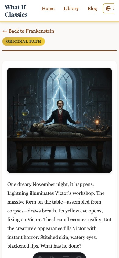
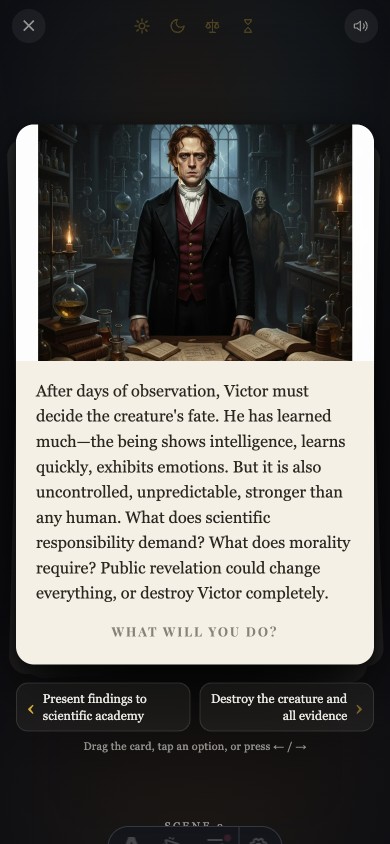
The old choice screen (top) was still a white page with the site header, a “← Back to Frankenstein” link, and a path badge sitting above the story text. Now it’s one card, two choices spelled out in full underneath it, and a single instruction line (“drag the card, tap an option, or press ←/→”).
Will I Actually Keep Using Fable?
This “Fable’s back” event turned out to be a genuinely good deal for me personally. On top of everything in the UI/UX renewal above, Fable also cleanly upgraded the site’s aging Astro framework, still on v5, to the latest version through a two-stage v6-then-v7 migration. Though my wife did give me some (light) grief about spending the whole weekend hunched over a laptop.
Truth is, I couldn’t stay hunched over it the whole weekend even if I’d wanted to. I’m on the Claude Pro plan, and running Fable burns through the 5-hour usage window in about 30 to 40 minutes. I squeezed as much progress as I could out of each cycle, but once the event ends I’ll be back on Sonnet, my regular model. I can’t justify paying usage-based pricing for a side project that doesn’t make any money yet.
Wrapping Up
I didn’t generate a single new story pack this weekend. All six existing story packs, Jekyll & Hyde, Frankenstein, Pride and Prejudice, The Great Gatsby, I Robot, and Wizard of Oz, kept their content exactly as it was. Only the way they’re presented changed, top to bottom. But it didn’t feel like a small change. It went from clicking through plain web pages with story text and illustrations, to playing something that actually feels like a properly made web game.
There are already two face-down cards sitting on the story list page, each one just says “new deck in the works.” Whether I fill that slot with new story packs next, or spend the time improving a gameplay experience that’s still pretty rough around the edges, I’m going to take a breath and think about it.